Internet Plan Finder Quiz
Why use a plan finder?
Internet as a service can be ambiguous for a user. With speeds as fast as they’ve ever been and more options than ever before, picking a plan that truly fits their needs can be frustrating. A traditional product selection page is daunting when you don’t know what you need. Why would they chose any service over another?
In rethinking the traditional flow of choosing an internet plan, we developed a plan finder tool that utilizes a concise and strategically weighted logic pattern to give users an accurate and authentic internet service recommendation.
I led UX and UI design efforts, utilizing Figma to create a scalable library of editable/flexible assets. I worked closely with engineering and the partner to refine usability while developing the overall look, interactions, prototypes, and flow of the tool.
What does it look like?
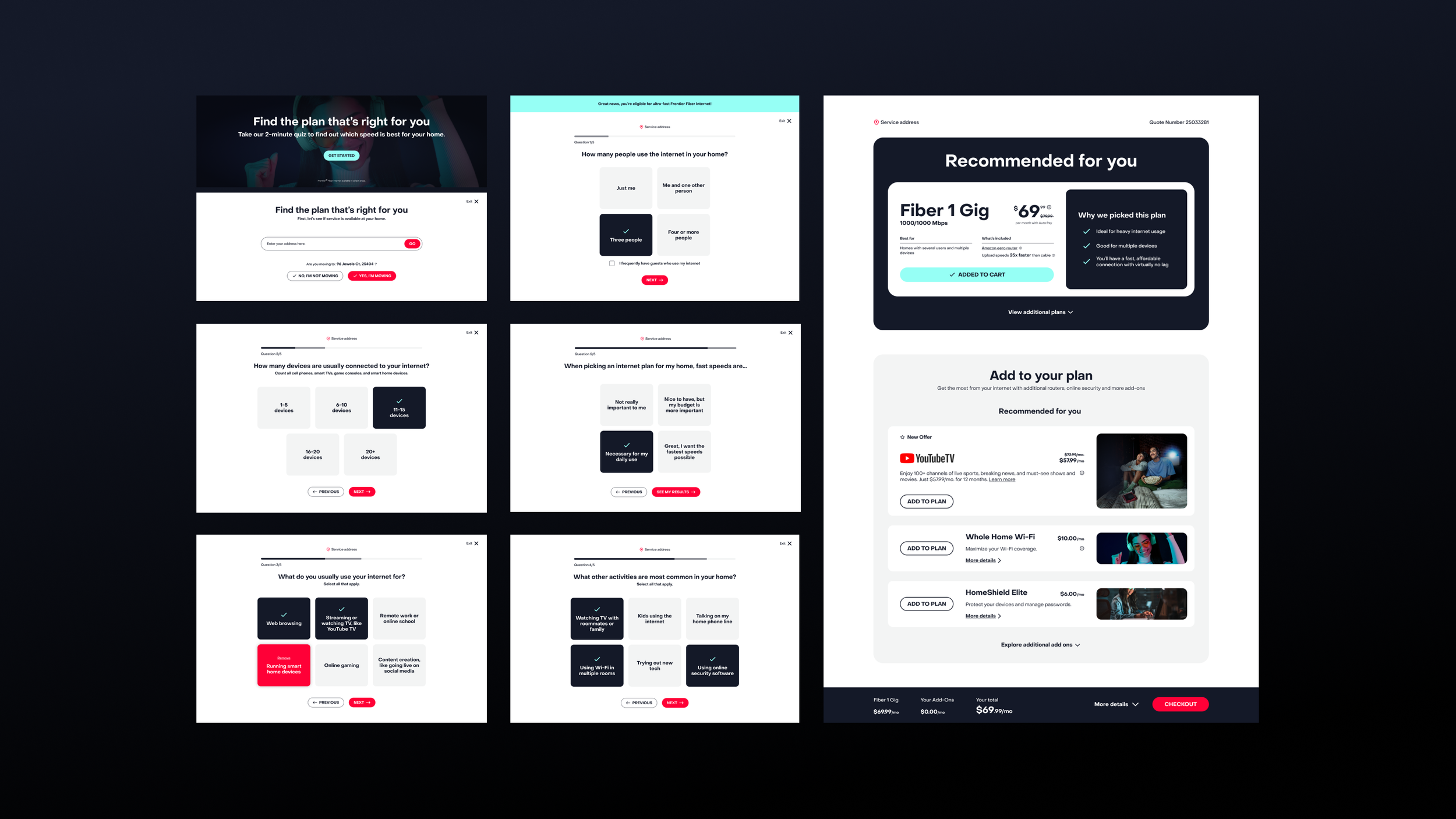
A simple 5 question quiz and a recommendation page.
Part one: the quiz.
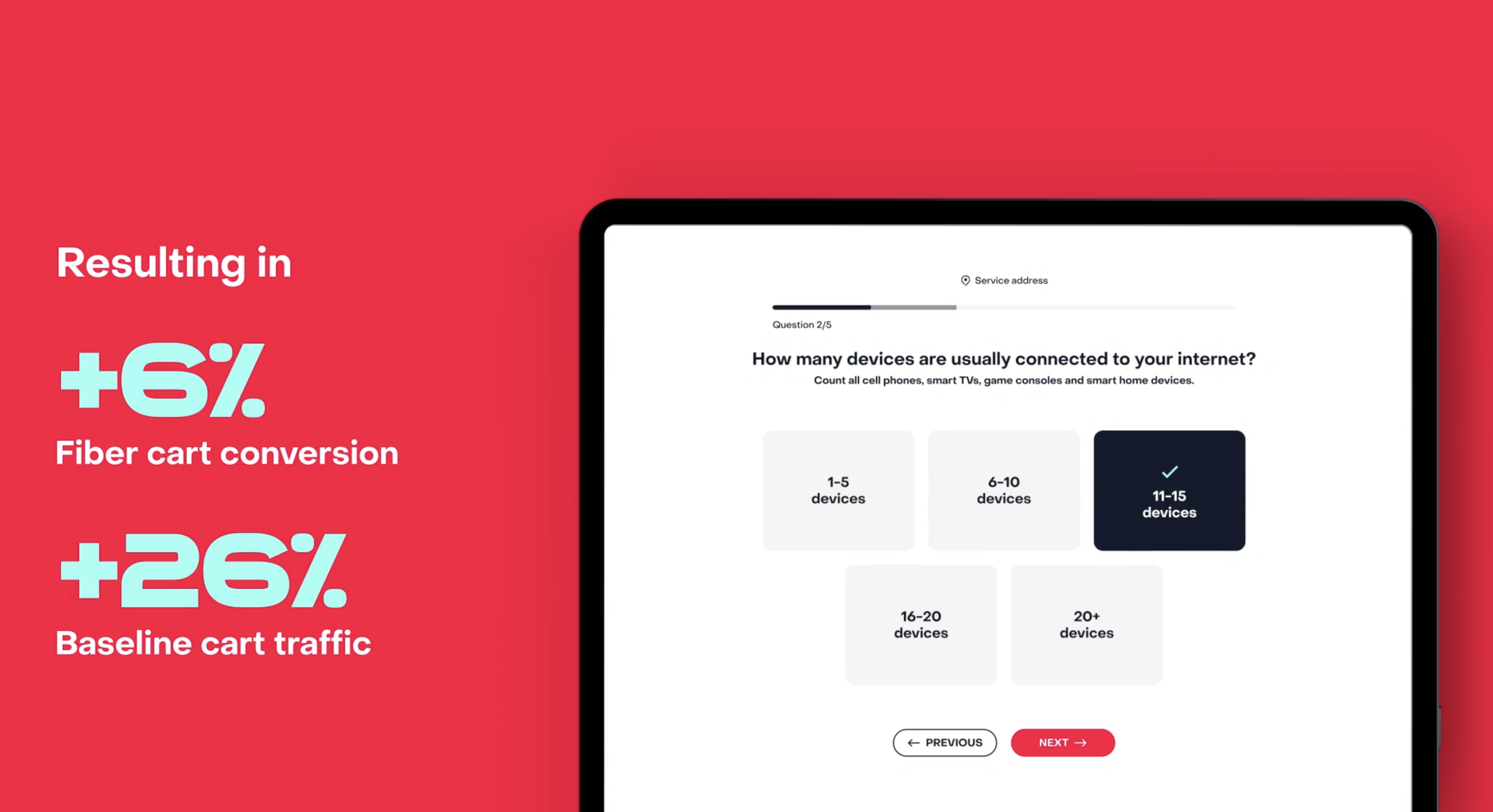
We put a lot of effort into reducing the quiz portion of this product into plain language that someone can easily understand and interact with. We also refined the amount of questions needed to give us enough information for an accurate recommendation.
Working closely with our engineers we were able to remove loader screens, so the user can progress smoothly through each phase of the tool.
Part two: the recommendation.
This page took a bulk of the creative development. Not only does it give users the best product for their needs, it gives them the option to customize their plan with various add-ons.
This page also functions in place of our traditional product selection page, so it is now the first step in our cart. This brings a host of requirements because any selections made here are added to their cart. All options (included additional plans that are available to them, but not recommended based on their answers) must be represented.
I developed a recommended plan module that highlights why we’ve selected this plan for them, reinforcing their answers. This module can also be expanded to show additional plans available to them, they can add one of these plans to cart in place of the recommendation if they choose.
Below that is a module of recommended add-ons. Our logic will take their answers from question 4 of the quiz and highlight up to 3 add-ons for them. We have a total of 6 add-ons available to all users, so the module can expand to show add-ons we are not highlighting.
I created a sticky order summary banner that rests on the bottom of the browser window. It will live update with the user’s plan and add-on selections to give them an estimated monthly price. It can also be expanded to show a break down of add-on prices. This has the check-out CTA that will drive users into the second half of our regular cart flow, blending this new tool in with our current check out process.


